FEBRUARY 1, 2026 · 3 min de leitura
Apple Creator Studio Review
Yesterday Apple released their new subscription targeted at digital creators called Creator Studio. I confess I was not too happy about this change. The price is fineish, depending on what you value and intend to use. But the biggest issue to me is that the subscription completely falls apart when you ignore Final Cut Pro or Logic Pro. Paying $12.99 a month to use both these apps is actually a huge deal, but for everything else... not really.
iWork
I was always a hugeee fan of iWork. Ever since I started using it in 2015. Especially Keynote. Keynote is so underated it actually hurts me. It's a billion times better than PowerPoint and I'm not even exagerating. Pages is also pretty good, but still lacking many features that are quite embarassing in 2026, like creating indices and citation support built-in, for example. Numbers is... okay. I much prefer Excel to be honest.
I got a bit scared after seeing that Apple was going to turn these apps Freemium.
I must say I'm very disapointed. The design refresh looks horendous. The same problemas with sidebars and toolbars are seen here. Maximazing the application looks like a joke. Lack of hiearachy and contrast are present throughout the design... I mean... what the hell!? I thought they had time to think this through and polish it. I can garantee, and I'm not exagerating, as I write this, Apple is on the drawing board rethinking Liquid Glass from scratch. The reality is that in its current state, there is no way to fix this. It's fundamentally skrewed to a point of no return. They need to rethink the whole design. And I really mean the WHOLE design, ranging from tvOS to macOS.
Now... I gotta address the themes. They're okay in Pages. There's a wide variety of them for many occasions. And they seem quite detailed too. Some more than others. I could swear some of them are copy pasted with just a different background image. This can't be said for Keynote. Seriously, what the hell... they look so dull and cheap. After years of seeing amazing Keynote presentations on Apple's marketing images through their webiste and events I was expecting more, A LOT more. Below is just an example of a Keynote on Apple's website from last year.
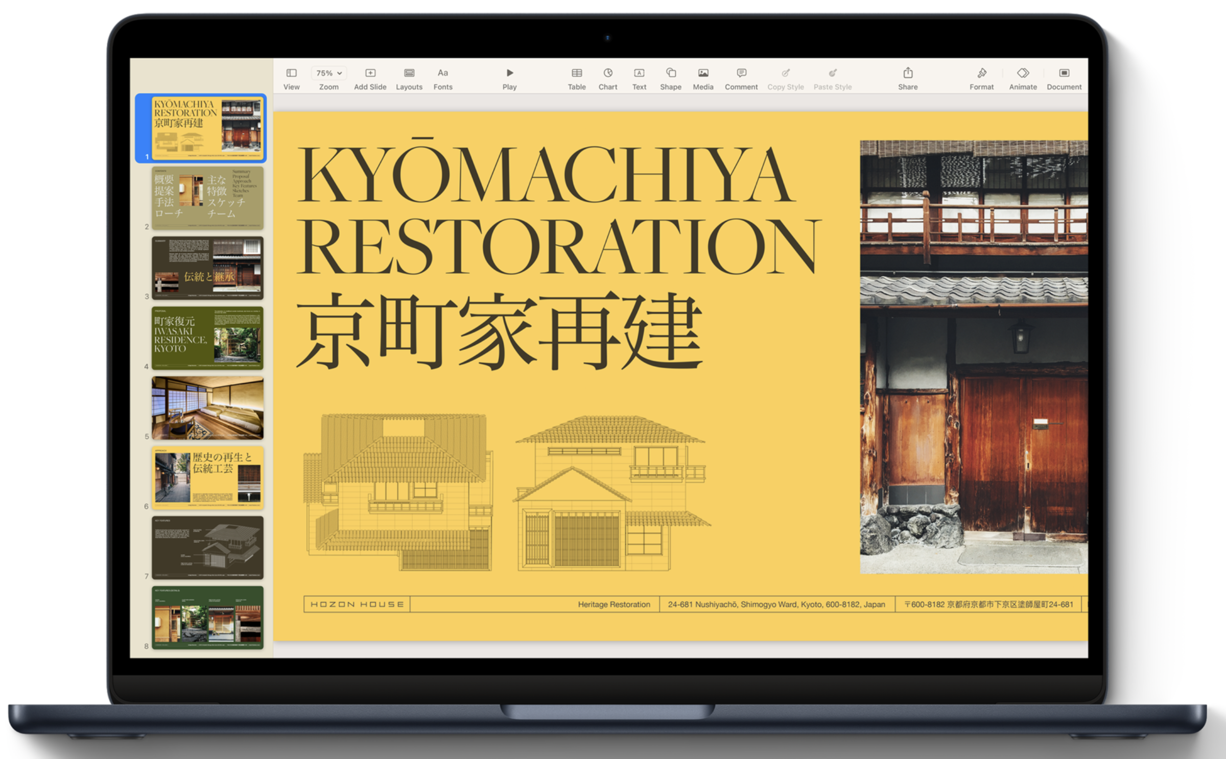
You see what I mean? It's actually embarassing. I would argue all Premium templates should have this level of care and detail. But not a single one even comes close. What are they doing? At this point, as crazy as it sounds, I feel more qualified to analyze and think about these things than Apple itself...
Creator Hub
I was skeptical about the Creator Hub but oh my god has it changed my mind. This is almost like a wallpaper pack apple is giving you. I'm probably going to use a ton of these photos as wallpapers on my iPhone and Macs. The diversity is also quite good, ranging from landscapes to symbols and illustrations. The symbols don't excite me too much. They look very cheap and... Samsungy. I'd much prefer just opening SF Symbols and picking one of Apple's symbols like I've been doing these past years. But I can't I wasn't impressed. I might genuinely pop in time to time to grab an image for a presentation or background. And I also hope Apple adds images over time.
Comentários